
How to make a responsive email
5 Apr 2016
Liz Franco
Zenario 7.2 has a new feature to add CSS styles and media queries, for email-clients that support these features. It should allow you to make emails that appear 'responsive' when viewed, i.e. they should size themselves according to the user's device, whether desktop, mobile smartphone or tablet.
Here is a quick how-to guide to responsive email design in Zenario.
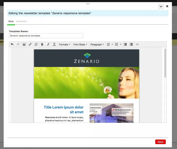
1. Go to Organizer > Email > Newsletters. Click 'Templates'. Then click 'Create a newsletter template' button.
2. Give a name to the new template and enter the content and design.
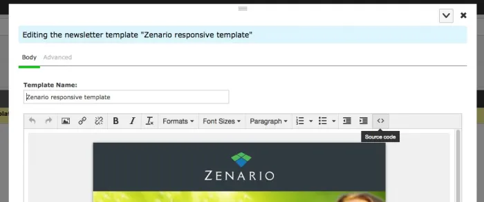
As you probably know by now it is very common to format emails with tables. We are going to add some classes to the tables so we can change their styles on the different windows sizes. You can do this by clicking 'Source code' on the editor and adding the classes on the HTML.
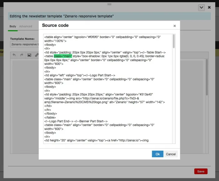
Click 'Ok' button to save your changes.
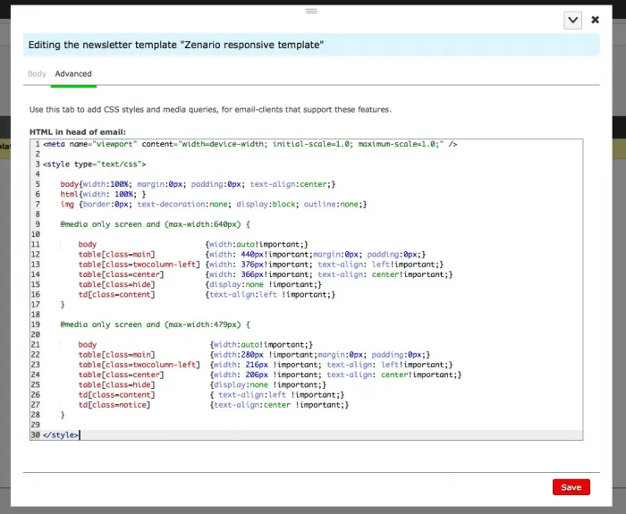
3. Now go to the 'Advanced' tab. And enter this tag on the 'HTML in head of email' area:
<meta name="viewport" content="width=device-width; initial-scale=1.0; maximum-scale=1.0;" />
This will make the email client recognize it as a mobile-optimized layout.
Next, you can enter the general styles and the @media rules for the different viewports. In this example we will add for 640px and 479px wide windows:
<style type="text/css">
body{width:100%; margin:0px; padding:0px; text-align:center;}
html{width: 100%; }
img {border:0px; text-decoration:none; display:block; outline:none;
@media only screen and (max-width:640px) {
body {width:auto!important;}
table[class=main] {width: 440px!important;margin:0px; padding:0px;}
...
}
@media only screen and (max-width:479px) {
body {width:auto!important;}
table[class=main] {width: 280px!important;margin:0px; padding:0px;}
...
}
</style>
So the code will look like this:
4. Save your changes.
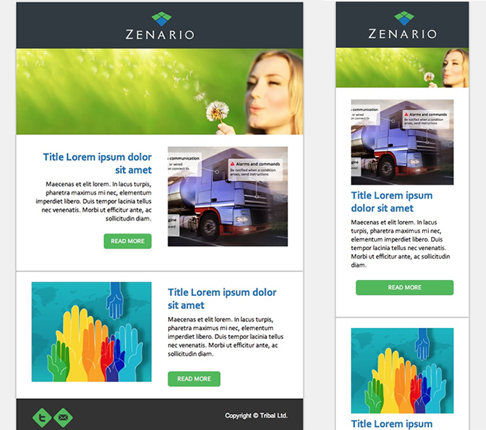
Your email will now adjust to the windows size:
Creating re-usable styles for your newsletter
Wouldn't it be nice be able to define a nice set of styles for your site's newsletters, that you can customise and then access at a click?
Well, you can!
Just look inside your zenario_custom folder and you should find a file called site_description.yaml. This is present from version 7.1 onwards. This file defines things about your site's custom environment.
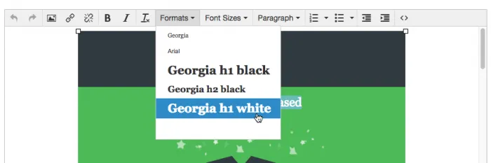
Look for the section called email_style_formats, and enter code like this:
email_style_formats:
-
title: 'Georgia'
inline: span
styles:
font-family: Georgia
-
title: 'Arial'
inline: span
styles:
font-family: Arial
-
title: 'Georgia h1 black'
block: h1
styles:
font-family: Georgia
color: black
If you don't have a description.yaml file, and you have file system access, you can copy a sample one from zenario/api/sample_site_descriptions/probusiness/site_description.yaml. You can use it to restrict the number of administrators that may be created, whether to enable the additional security features, and so on.
Remember to use multiples of four spaces at the start of every line in a .yaml file, so make clear to the reader the data hierarchy.